

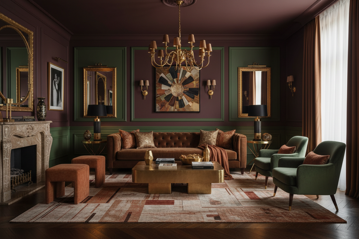
Chocolate brown and deep colours: why 2026 is the year of chromatic courage
By Alberto Capuzzo, co-founder — Restylit | LinkedIn
What is chocolate brown in the interior design of 2026? It's the deep, warm brown that evokes cocoa, mahogany and burnt earth — and which according to 1stDibs data is cited by 33% of international designers as the dominant colour of the year. It's not a passing trend: it's part of a broader movement toward deep and enveloping colours that began to emerge in 2023 with biscuit and greige, passed through forest green in 2024, and in 2026 has found in chocolate brown its most mature and complex expression.
In short: 2026 is the year in which the Italian design world is finally abandoning its fear of colour. Not the courage of garish colours, which tire quickly, but that of deep and desaturated colours that create enveloping, warm and visually rich environments without ever becoming oppressive.
What you'll find in this guide. The market data confirming the trend, why chocolate brown works so well in interiors, how to use it without getting it wrong, which palettes it pairs with. In previous articles we've already discussed colour drenching and the tactile home, and this article closes that circle by showing how deep colour becomes the natural endpoint of both approaches.
The Data That Struck Me
I've been working in this field for a few years now and I've learned to look at market data with a certain scepticism. Colour trends get declared every year by someone, and often what gets announced as "the colour of the year" is more a marketing exercise than a genuine reading of the market.
But the 33% of international designers citing chocolate brown as the dominant colour of 2026 in the 1stDibs data is a different kind of number. It's not a paint company promoting its product of the year. It's a platform that aggregates the choices of thousands of professionals and records what is actually happening in homes.
And when I started looking at the projects coming to us, the inspirations clients send, the questions they ask us, I found the same confirmation. Deep brown is everywhere. Not the 1970s brown of dark formica and brown leather sofas: the contemporary brown, warm, terracotta-tinged, closer to dark chocolate or a long espresso.
Why Chocolate Brown Works So Well
Brown is a colour that in the collective imagination has been associated for decades with vintage, retro, something dusty and dated. In the 1980s and 90s it was the colour to avoid. In the 2000s, white and grey almost completely replaced it in Italian homes.
What's happening now is a shift in perception with precise reasons.
Deep brown is the colour of earth and wood
In biophilia — the principle by which human beings instinctively seek connection with the natural world — brown is one of the colours with the most consistently positive emotional response. It evokes earth, wood, bark, humus: elements of the natural landscape that the human nervous system has learned to read as safe and reassuring over millions of years of evolution.
An environment with elements in chocolate brown doesn't feel heavy as you might expect: it feels grounded, solid, protective. The psychological perception is of a safe place to be.
Desaturated brown (perhaps) doesn't tire
The version of brown that works in contemporary design is not the saturated, opaque brown of faux-wood panelling. It's chocolate brown with a grey component — what designers call "toned-down" or "burnt" brown — which has enough grey in it never to feel too warm or too earthy.
This kind of brown, exactly like the sage green or teal that dominated previous years, has the property of changing appearance with the light in an interesting rather than tiring way. In the morning it seems lighter and earthier. In the evening, under warm 2700K lamp light, it becomes almost amber, enveloping, deep.
It pairs with everything
Chocolate brown is one of the most versatile neutral colours in existence. It works with white and cream, with beige and greige, with green in all its forms, with rust and terracotta, with black, with copper and brass. It's hard to find a colour it doesn't speak to.
This versatility makes it an excellent base colour, whether you choose to use it on walls in colour drenching or as the colour of the main sofa, the principal piece of furniture or a single accent wall.
How to Use It Without Getting It Wrong
In colour drenching
Chocolate brown in colour drenching — walls, ceiling and skirting in the same colour — creates one of the most enveloping and sophisticated environments in contemporary design. It works best in rooms with good natural light, where the depth of colour is balanced by luminosity. In very dark rooms it can become oppressive.
The version that works best for colour drenching isn't full chocolate brown but a slightly lighter version, closer to dark caffe latte or muted mahogany, which maintains the depth without completely eliminating light reflection.
As the colour of the protagonist piece of furniture
A chocolate brown sofa in a neutral living room is one of the most beautiful contrasts you can create in a contemporary Italian home. The deep brown sofa on a light wood floor, with warm white walls and raw linen textiles: it's the combination that more than any other represents the 2026 aesthetic.
As an accent on one wall
A chocolate brown wall in an otherwise neutral room is the least demanding and most versatile version of this trend. It works particularly well in the bedroom as a headboard wall, or in the dining zone as a backdrop to the table.
In textiles
A cushion, a throw, a rug in chocolate brown: it's the easiest way to introduce the colour without any structural commitment. Textiles in this tone work with almost everything and immediately create a sense of warmth and depth that neutrals can't replicate.
The Palettes That Work with Chocolate Brown
Chocolate brown + ivory white + natural linen
The most classic combination and the one with the most elegant result. Ivory white — not pure white — balances the warmth of brown without creating excessive contrast. Natural linen adds texture and naturalness. It's the 2026 palette in its most refined version.
Chocolate brown + sage green + copper
Sage green softens the warmth of brown and brings freshness. Copper as an accent in details — handles, lamps, frames — adds a metallic touch that doesn't tire. It's the most contemporary palette and the one that works best in living rooms with a mix-of-styles approach.
Chocolate brown + terracotta + cream
All earth tones, all warm, all desaturated. It's the palette most coherent with the tactile home aesthetic we described in our dedicated article: colours that evoke natural materials, organic textures, a direct relationship with earth and the natural landscape.
Chocolate brown + black + white
The most graphic combination and the one with the highest contrast. Works very well in styles with industrial influences or in living rooms with historic design elements. It's the least soft palette but the one with the strongest character.
The Connection with Colour Drenching and the Tactile Home
In our article on colour drenching we explained why painting an entire room the same colour works better than any other technique for creating depth and visual intentionality. In our article on the tactile home we explained why texture has replaced colour as the main language of 2026 design.
Chocolate brown is the natural meeting point of these two approaches.
An environment in colour drenching with chocolate brown — all the same deep, desaturated colour — and materials with natural texture, wood with visible grain, raw linen, handmade ceramics: it's the most complete expression of the 2026 aesthetic. It's not a colour on top of the materials: it's a colour that enhances the materials, puts them in the spotlight, creates the context in which textures express themselves best.
Why Now
There's a question I get asked often when we talk about this trend: why now? Brown has always been around. Why does it become dominant in 2026 specifically?
The most honest answer I have is this: after years of white, grey and antiseptic minimalism, people want warmth. Not the kitsch warmth of garish colours: the deep, reassuring, almost primordial warmth of earth colours.
We've come through a complicated period. Homes have become the place where more time is spent than ever before. And in that time, white and grey homes have shown their limitations: functional, clean, but not very enveloping. Not very human, in the literal sense.
Chocolate brown, and deep colours in general, are design's response to a need for warmth and groundedness that antiseptic minimalism couldn't satisfy.
It's not a trend. It's a return to something more fundamental.
Are you thinking of bringing chocolate brown or a deep colour into your home but not sure how? The Basic+3D consultation (from €249) includes a photorealistic rendering showing exactly how that colour will look in your specific space, with your light and your furniture, before buying a single tin of paint. Book now →
To quickly understand which shade of brown works for your space and how to pair it, the Basic consultation (€129, 45-minute video call) answers this question precisely. Discover the Basic package →
FAQ
What is chocolate brown in 2026 interior design? Chocolate brown is a deep and desaturated brown, evoking dark chocolate, mahogany and burnt earth, which according to 1stDibs data is cited by 33% of international designers as the dominant colour of 2026. It's not the dated brown of the 1970s: it's a contemporary version with a grey component that makes it versatile, non-tiring and compatible with almost any palette.
How do you use chocolate brown at home without making it feel heavy? The three keys are: choose a desaturated version with a grey component rather than full brown, balance it with light colours such as ivory white, cream or natural linen, and pair it with natural-texture materials that bring out its depth. Chocolate brown in colour drenching works best in rooms with good natural light. As an accent on a single wall or in the main piece of furniture, it works in any room.
What colours pair with chocolate brown? Chocolate brown pairs with almost everything: ivory white and cream for an elegant, refined result; sage green for a contemporary touch; terracotta and rust for an all-earth-tones palette; black and white for a stronger graphic contrast. The metals that work best are copper, brass and bronze. Polished chrome and nickel create too cold a contrast.
Is chocolate brown a passing trend or will it last? Deep and desaturated colours like chocolate brown tend to have a much longer lifespan than more saturated and vivid colours. They have the property of changing appearance with the light in an interesting way without tiring quickly. Sage green, which dominated 2022-2023, is still perceived as contemporary because it has this same quality. Chocolate brown has the same characteristics and will probably remain relevant for at least four or five years.
Restylit is an Italian interior design company, entirely online. Photorealistic 3D renderings, shoppable lists, technical drawings for the contractor. Over 500 completed projects, 4.8/5 on Trustpilot.


